``` {r setup, include=FALSE}
source("R/setup.R")
library(patchwork)
```
# ggplot2 helper packages
`ggplot2` is the heart of a vast network of packages that enhance it.
This a an annotated list of packages that I find useful.
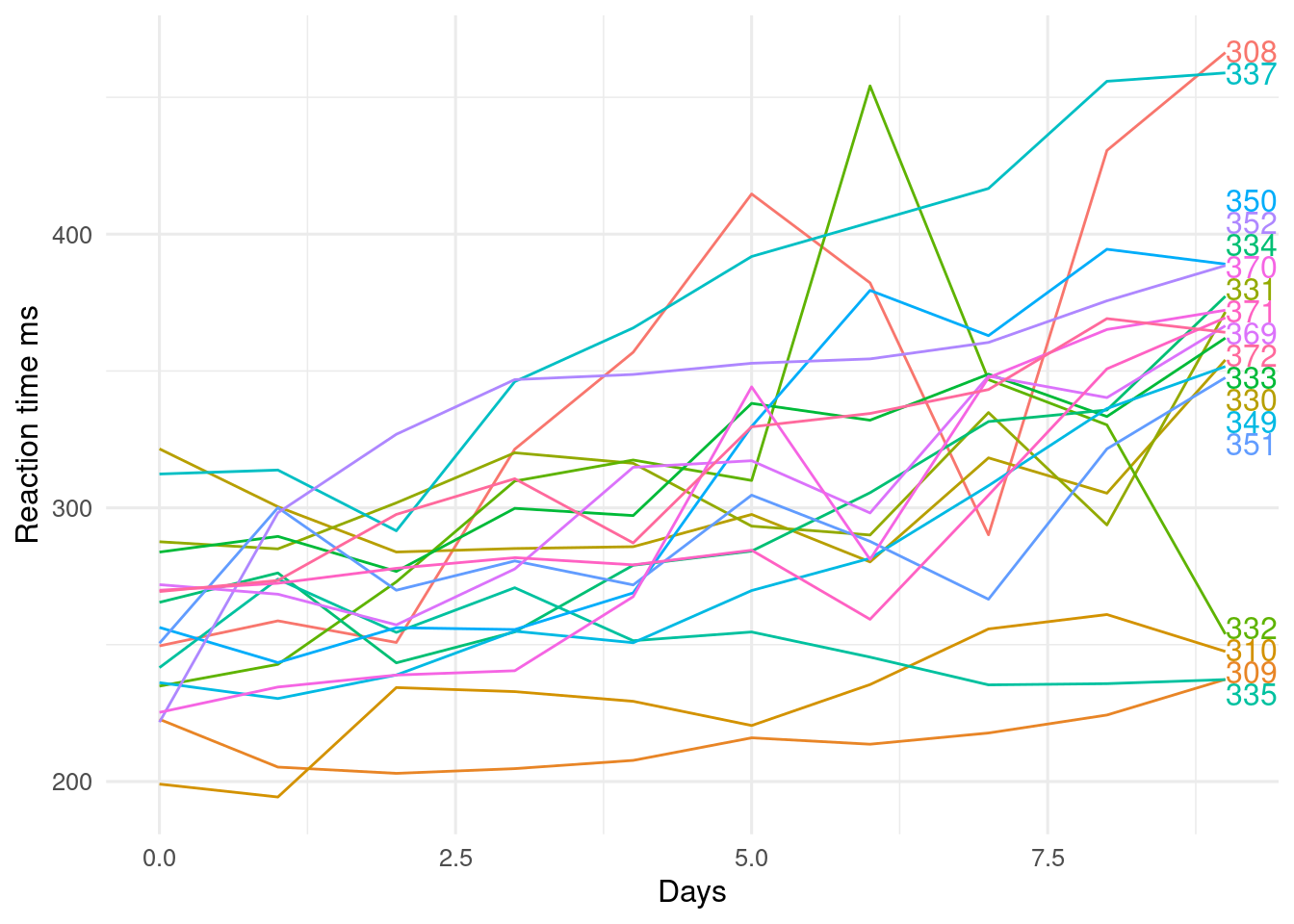
## `directlabels`
The `directlabels` package helps add labels to plots as a alternative to including a legend.
```{r}
#| label: fig-directlabels
#| fig-cap: >
#| Reaction time against day of sleep deprivation experiment.
#| Subject ID are on the right of the plot.
#| fig-alt: >
#| Line graph showing reaction time against day of sleep deprivation
#| experiment. Subject ID are on the right of the plot next to their
#| respective line and with the same colour as the line.
library(directlabels)
p <- ggplot(lme4::sleepstudy, aes(x = Days, y = Reaction, colour = Subject)) +
  geom_line() +
  labs(y = "Reaction time ms")
direct.label(p, method = "last.qp") # last - go after plot, qp - don't overlap
```
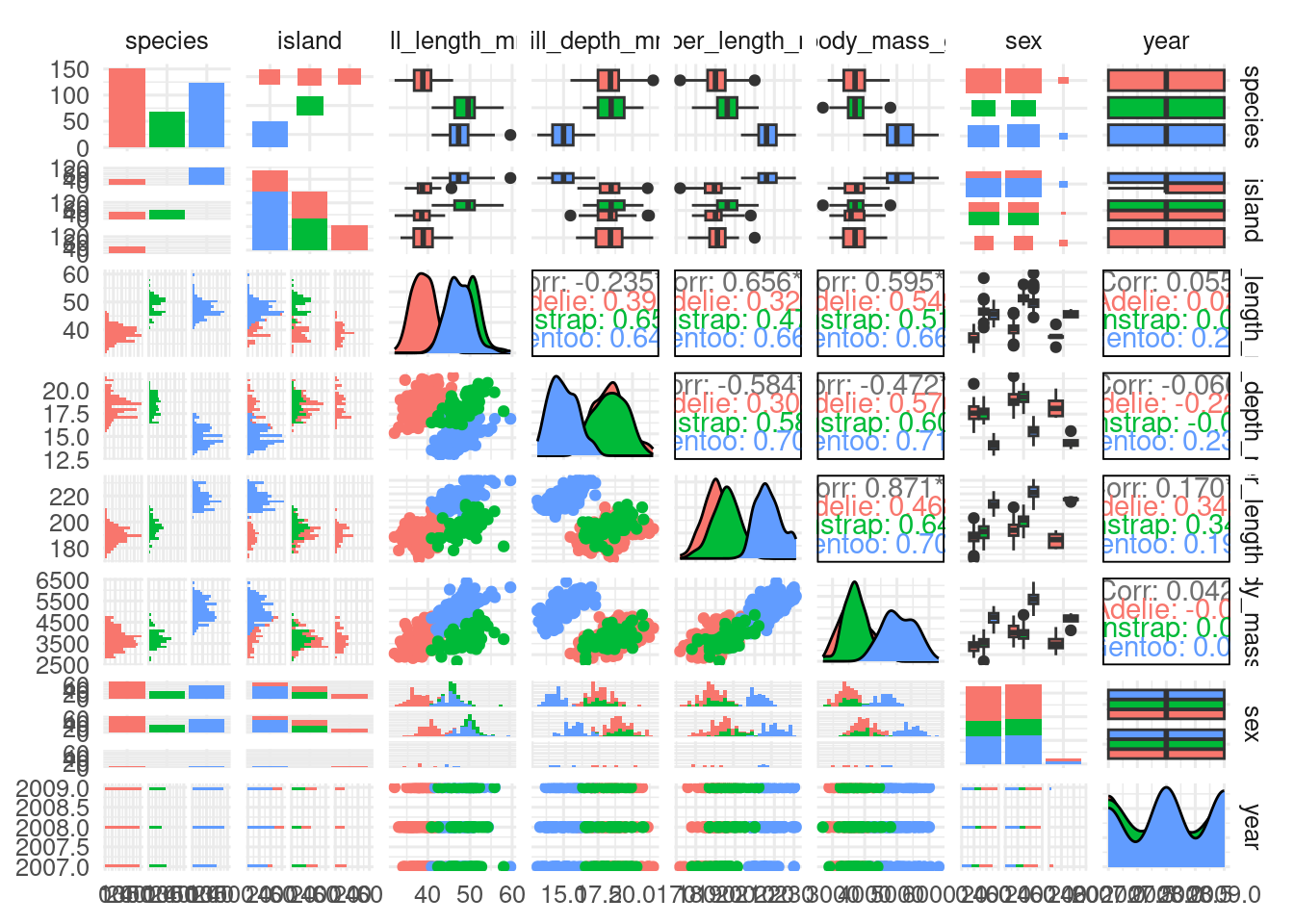
## `GGally`
Among other functions, `GGally` includes `ggpairs()` which makes a matrix of plots, plotting each variable in a dataset against every other variable.
This is a useful exploratory method.
Different combinations of variable types (continuous vs categorical) get different types of plot.
```{r}
#| label: fig-ggally
#| fig-cap: ggpairs() applied to the penguins dataset
#| fig-alt: >
#| Matrix of plots that show each variable in the penguins dataset plotted against
#| every other variable.
#| results: hide
#| message: false
#| warning: false
library(GGally)
ggpairs(penguins, mapping = aes(colour = species))
```
## `gganimate`
It won't animate a Disney film, but `gganimate` will help bring your data to life.
```{r}
#| label: fig-gganimate
#| fig-cap: Relationship between life expectancy and GDP per capita over time.
#| fig-alt: >
#| Animation of the relationship between life expectancy and GDP per capita
#| over time using the gapminder dataset.
library(gganimate)
library(gapminder) # world health data

ggplot(gapminder, aes(x = gdpPercap, y = lifeExp, size = pop, colour = continent)) +
  geom_point(alpha = 0.7) +
  scale_colour_manual(values = continent_colors) +
  scale_size(range = c(2, 12), guide = "none") +
  scale_x_log10() +
  theme(
    legend.position = "inside",
    legend.position.inside = c(0.99, 0.01),
    legend.justification = c(1, 0)
  ) +
  labs(
    title = "Year: {frame_time}", x = "GDP per capita US$",
    y = "Life expectancy yr", colour = "Continent"
  ) +
  transition_time(year) # animates ggplot
```
This is not so useful for traditional journals (except perhaps in supplementary material), but some new journal may accept animations and other video.
It is good for presentations and websites.
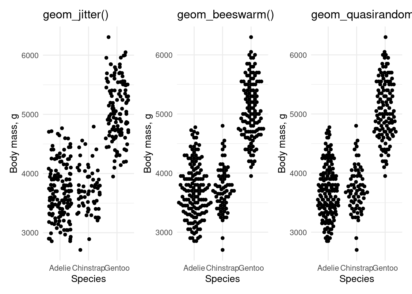
## `ggbeeswarm`
`ggbeeswarm` includes `geom_quasirandom()` and `geom_beeswarm()` which are alternatives to `geom_jitter()` for plotting data with a continuous dependent variable and categorical independent variable.
```{r}
#| label: fig-ggbeeswarm
#| warning: false
#| echo: false
#| fig-cap: "`geom_jitter()` and alternatives from the `ggbeeswarm` package"
#| fig-alt: >
#| "Plots of penguin body mass by species made using `geom_jitter()`
#| and alternatives from the `ggbeeswarm` package"
library(ggbeeswarm)
p <- ggplot(penguins, aes(x = species, y = body_mass)) +
labs(x = "Species", y = "Body mass, g")
c("geom_jitter()", "geom_beeswarm(cex = 2.5)", "geom_quasirandom()") |>
map(\(geom) {
p + eval(parse(text = geom)) +
ggtitle(paste0(str_extract(geom, "geom_[a-z]*"), "()"))
}) |>
patchwork::wrap_plots()
```
## `ggfortify`
The `ggfortify` package includes `autoplot()` functions for several types of objects, including (generalised) linear models, time series, and survival analyses.
## `gghighlight`
The `gghighlight` package helps highlight part of the data see @sec-highlight for an example.
## `ggiraph`
The `ggiraph` lets you make interactive plots.
Use `geom_*_interactive()` to get tooltips.
```{r}
#| label: fig-ggiraph
#| fig-cap: >
#| Interactive plot of life expectancy against GDP per capita in 1972. Hover
#| mouse over a point to see which country it represents.
#| fig-alt: >
#| Interactive plot of life expectancy against GDP per capita from the
#| gapminder dataset.
#| Hovering the mouse over a point brings up a tool tip that shows which
#| country it represents.
library(ggiraph)
# remove ' from cote d'Ivoire
gapminder <- gapminder |>
  mutate(country2 = str_replace(country, "'", "")) |>
  filter(year == 1972)

p <- ggplot(
  gapminder,
  aes(x = gdpPercap, y = lifeExp, colour = continent, size = pop)
) +
  geom_point_interactive(aes(tooltip = country, data_id = country2, alpha = 0.7)) +
  scale_colour_manual(values = continent_colors) +
  scale_size(range = c(2, 12), guide = "none") +
  scale_x_log10() +
  theme(legend.position = "none") +
  labs(x = "GDP per capita US$", y = "Life expectancy yr", colour = "Continent")


girafe(
  ggobj = p,
  options = list(opts_hover(css = "fill: red"))
)
```
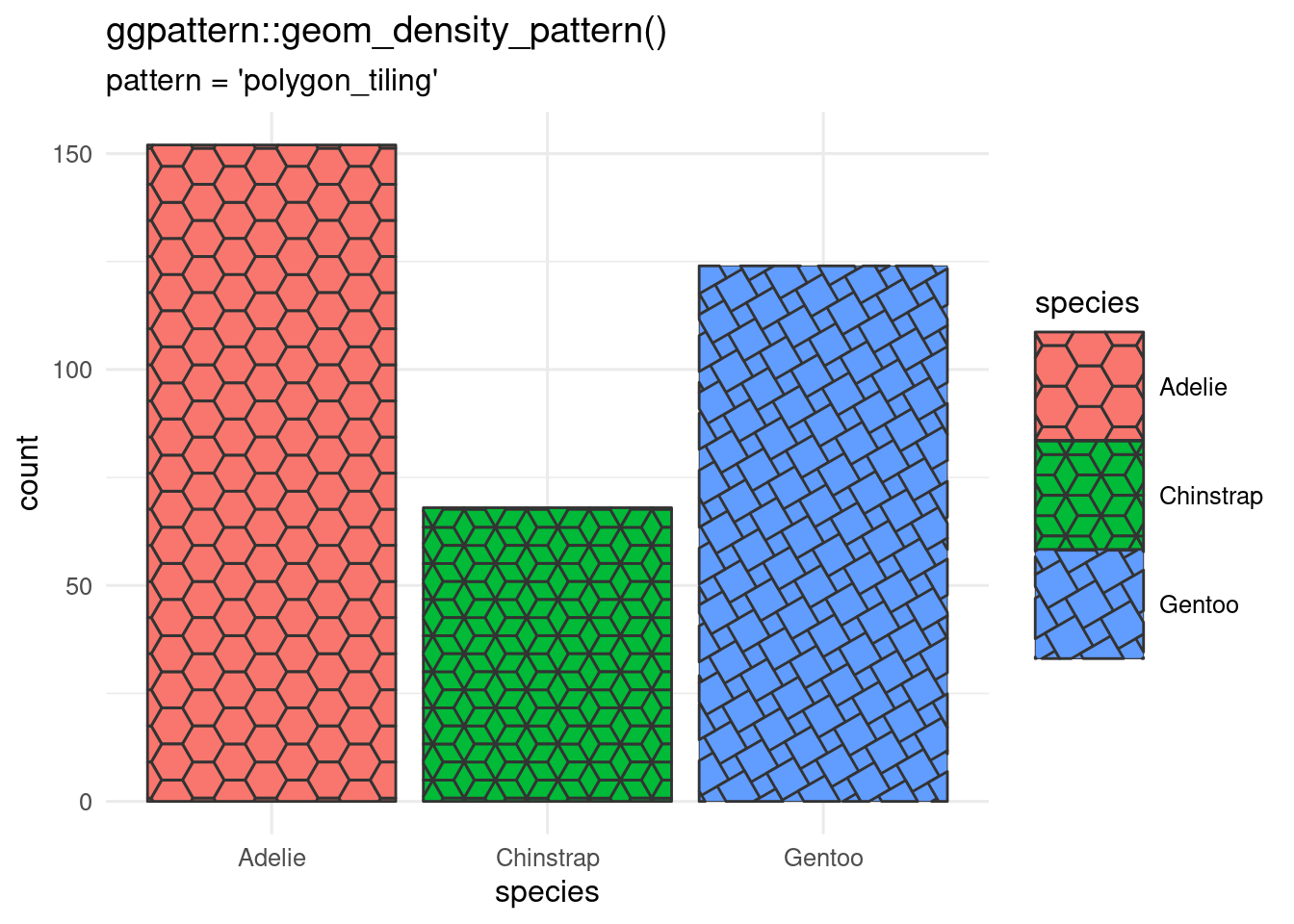
## `ggpattern`
Bored with solid fills?
`ggpattern` can give you textured fills with `geom_*_pattern()` where the `*` is any of the geoms that take a fill argument.
```{r}
#| label: fig-ggpattern
#| fig-cap: >
#| Bar chart made with `geom_bar_pattern()`
#| showing three different pattern types.
#| fig-alt: >
#| Barchart of the penguin data showing three different pattern types and a
#| larger legend than default so the patterns show clearly.
library(ggpattern)
ggplot(penguins, aes(x = species)) +
  geom_bar_pattern(
    aes(
      pattern_fill = species,
      pattern_type = species
    ),
    pattern = "polygon_tiling"
  ) +
  scale_pattern_type_manual(values = c("hexagonal", "rhombille", "pythagorean")) +
  theme(legend.key.size = unit(1.5, "cm")) + # larger legend
  labs(
    title    = "ggpattern::geom_density_pattern()",
    subtitle = "pattern = 'polygon_tiling'"
  )
```
## `ggraph`
The `ggraph` package lets you plot network graphs, including dendrograms.
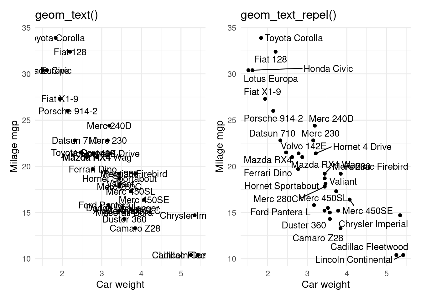
## `ggrepel`
If you want to label points on a plot, but the labels overlap, `ggrepel` can help.
```{r}
#| label: fig-ggrepel
#| fig-cap: "`geom_text()` and `geom_text_repel()`"
#| fig-alt: >
#| Plots of milage against weight for cars.
#| Left plot labels points with geom_text(), with a lot of overlapping text.
#| Right plot uses geom_text_repel() to avoid overlapping.
#| warning: false
library(ggrepel)

# base plot
p <- ggplot(mtcars, aes(x = wt, y = mpg, label = rownames(mtcars))) +
  geom_point() +
  labs(x = "Car weight", y = "Milage mgp")

# add labels (use geom_label/geom_label_repel to add background rectangle to text)
p1 <- p + geom_text() + ggtitle("geom_text()")
p2 <- p + geom_text_repel() + ggtitle("geom_text_repel()")

# combine with patchwork
p1 + p2
```
## `ggspatial`
The `ggspatial` package helps plot maps. See @sec-map-making for some examples using this package.
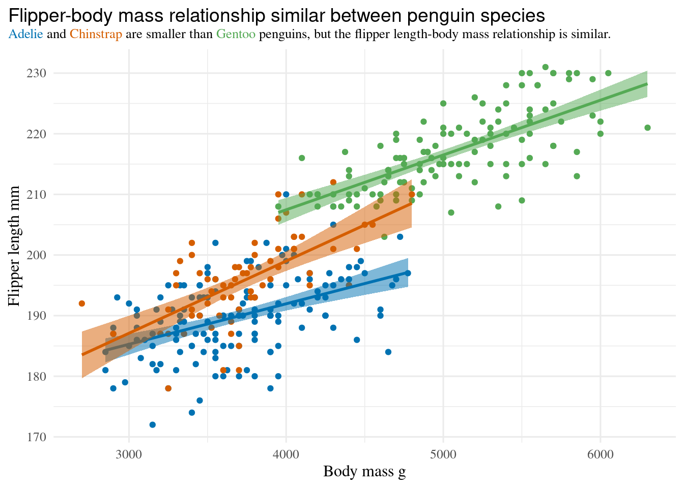
## `ggtext`
The `ggtext` package lets you use markdown wherever there is text in a plot.
This lets you add formatting (colour, bold, italics etc) to text (with `geom_richtext()`) or axis labels and titles by using `element_markdown()` in the theme.
This can be an alternative to using a legend.
```{r}
#| label: fig-ggtext
#| warning: false
#| fig-cap: >
#| Coloured text in the title indicates which species is which,
#| so a legend is not required.
#| fig-alt: >
#| Plot of penguins flipper-length against body-mass.
#| Plot title has coloured text to indicate the species, so a legend is not required.
library(ggtext)

ggplot(penguins, aes(x = body_mass, y = flipper_len, color = species)) +
  geom_point() +
  geom_smooth(method = "lm", aes(fill = after_scale(colour)), alpha = 0.5) +
  scale_color_manual(
    values = c(Adelie = "#0072B2", Chinstrap = "#D55E00", Gentoo = "#55aa55"),
    guide = "none" # one way to drop legends
  ) +
  labs(
    x = "Body mass g",
    y = "Flipper length mm",
    # title has formatting
    title = "<span style = 'font-size:14pt; font-family:Helvetica;'>
    Flipper-body mass relationship similar between penguin species</span><br>
<span style = 'color:#0072B2;'>Adelie</span> and
<span style = 'color:#D55E00;'>Chinstrap</span>
are smaller than <span style = 'color:#55aa55;'>Gentoo</span> penguins,
but the flipper length-body mass relationship is similar."
  ) +
  theme(
    text = element_text(family = "Times"),
    plot.title.position = "plot",
    plot.title = element_markdown(size = 10, lineheight = 1.2)
  )
```
## `ggvegan`
`ggvegan` (install from [GitHub](https://github.com/gavinsimpson/ggvegan)) has `autoplot()` functions to plot ordinations and other objects from the `vegan` package.
## `patchwork`
`patchwork` is used to combine plots into a single figure.
See @sec-combining-plots for information on how to use this package.
::: {.column-margin}
### Contributors {.unlisted .unnumbered}
- Richard Telford
:::